Tidy RNA sequencing visualization
Today, I will be presenting my journey to finding the right R packages that can take RNA sequencing coverage files and annotation information as input and output nicely formatted slim pdf files for loci of interest. I’m grateful to the package developers and users who showed how they manage this task.
Initial files preparation
Bigwig files and a GFF3 annotation file are the only required input, together with the coordinates of the region of interest that was identified beforehand with IGV. To get bigwig files from regular, text-base, wig, the wigToBigWig utility from the ENCODE consortium is fast and simple. I recovered the Linux binary file and called it directly with the input files. The command line to transform an input.wig file to its equivalent output.bw requires only an additional text file that contains the size of the chromosomes. The chromosomesizes.txt file is tab delimited and has two columns - first the chromosome name and second, its size in nucleotides, without a header.
wigToBigWig input.wig chromosomesizes.txt output.bw
To apply this command to a number of wig files, I used Fish, an alternative command line shell that has some included utilities that come very handy and seem less obscure than their equivalent in bash . A few hints about using it: variables are assigned with the set command - for example set FILEDIR /home/myusername/thefolder; an included string replace utility can be very handy to shift file names with regular expression support. Example: string replace -r 'regex p(atte)rn' '$1 replacement' $FILE will search for the given pattern and keep the region between the round parantheses in the new replaced pattern ($1 part). Another useful utility in fish is path basename $FILE that returns the file name without its path or slashes. Finally, a list of files can be obtained with set FILES (find -name "*something*.wig") and each element of the list can be called with a numerical index - for example $FILES[1]. This is especially interesting in a loop:
for fileidx in (seq 1 (count $FILES))
	set INFILE (path basename $FILES[$fileidx])
	set OUTFILE (string replace -r '(.+)something.+' 'newpath/$1_str.bw' $INFILE)
	$WIGTOBIGWIG $INFILE $CHROMSIZESFILE $OUTFILE
	echo $OUTFILE
end
Testing coverage and annotation tracks visualization
My first successful attempt of visualizing RNASeq data from within R used Gviz. Gviz has been around for a long time and continues to be maintained. An excellent illustrated introduction to its capabilities was written by Isabelle S. on the bioinfo-fr.net collaborative blog in 2024. Together with the nice documentation of the package, obtaining reasonably looking graphical representations of my tracks was quick. Exporting to high resolution png images was not a problem either. However, even if there are tons of customization options available to make the plot look exactly as you want, I still like to be able to import it in Inkscape for further annotation.
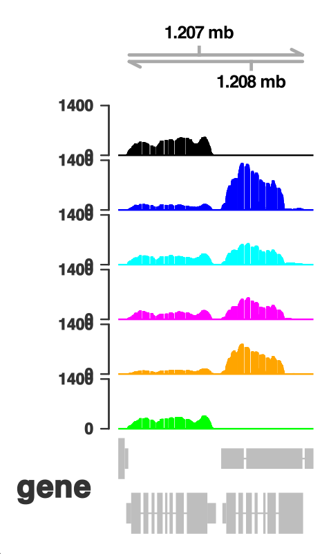
This is where I could not find a viable option with Gviz - the exported pdf files were gigantic, a problem that I also had in the past when exporting tracks from IGV. There is no way to handle this other than changing the visualization method. This is where I went searching for an alternative.
tidyCoverage and ggtranscript matched by patchwork
I was curious how a newly described package, tidyCoverage developed by a person who works at my Institute, Jacques Serizay, would work for my needs. One of its appeal was the integration with the tidyverse concept of data manipulation and visualization. Moreover, a working example was available in the documentation and looked relatively easy to adapt to my own files.
The first step in looking at coverage is to load the file content from a list of available files:
trackstidy_str1 <- str1tracks_files |>
  purrr::map(rtracklayer::import, as = 'Rle')
This may take some time, depending on the number of files (they were the bigwig files generated earlier). To create a CoverageExperiment object from the loaded files for a given region - the command would be:
mylocus.ce <- CoverageExperiment(
  trackstidy_str1,
  GRangesList(list(locus1 = "chromosome_name:1000-2000"))
)
Replace chromosome_name with the actual correct identifier for the chromosome and the coordinates with the ones established, for example in IGV.
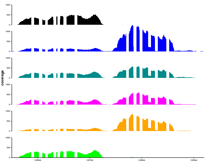
Next, obtain a “long” version of the data that is suitable for representing in a ggplot2. For the order of tracks, I also use the factor function for my own ordering, that will be preserved in the coverage plot.
mylocus.ce.long <- tidyCoverage::expand(mylocus.ce)
mylocus.ce.long$track <- factor(x=locusCPA1.ce.long$track, levels=c("cond4", "cond1", "cond3"))
Finally, to represent the coverage along the selected locus:
mylocus.ce.plot <- mylocus.ce.long |>
  ggplot() +
  geom_coverage(aes(fill = track)) +
  facet_grid(track~features, scales='fixed')+
  theme(legend.position="none")+
  scale_fill_manual(values=c("black", "blue", "darkcyan"))+
  theme(text=element_text(size=rel(3)),
        panel.border = element_blank(),
        plot.title = element_blank(),
        panel.margin = unit(0, "lines"))
There are several options that are shown in the above command just to illustrate the flexibility of the plots, as they are in the ggplot realm. All the elements can be customized and adjusted for the final export when preparing a figure.
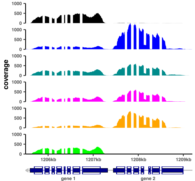
As I could not find a way to simply add an annotation track to this image, I took a look at the ggtranscript package, which has a nicely illustrated documentation - essential for quick adoption. To be able to use it fully, the first step is to import a GFF or equivalent annotation file:
library(rtracklayer)
library(dplyr)
gtf <- rtracklayer::import.gff3("mygfffile.gff")
gtf.tb <- gtf %>% dplyr::as_tibble()
Next, we can, for example, look at a region that contains two genes of interest, let’s say GENE1 and GENE2 that are neighbours in the genome.
mygenes <- c("GENE1", "GENE2")
mygenes_annot <- gtf.tb |>
  filter(!is.na(gene_id),
         gene_id %in% mygenes)
# extract the required annotation columns
# the columns might not have standard names, especially gene_id
mygenes_annot.short <- mygenes_annot %>%
  dplyr::select(
    seqnames,
    start,
    end,
    strand,
    type,
    gene_id
  )
Some additional tibbles for the coding and exon regions can be generated, together with the limits of the annotation (identical with the limits of the coverage region in the tidycoverage plot):
mygenes_exons <- mygenes_annot.short   |> dplyr::filter(type=="exon")
mygenes_cdss <- mygenes_annot.short  |> dplyr::filter(type=="CDS")
mygenes_introns <- to_intron(mygenes_exons, group_var = "gene_id")

plotlimits <- c(1000, 2000)
plotmin <- min(plotlimits)
plotmax <- max(plotlimits)
Finally, these informations can be gathered together for a nicely formatted annotation track, that will be next added to the coverage track.
annotplot <-  ggplot(data=mygenes_exons,
                         aes(xstart=start, xend=end, y=1)) +
  geom_hline(yintercept = 1, color="gray")+
  #an arrow to show the strand orientation - optional
  geom_segment(x=plotmax, y=1, xend=plotmin, yend=1,
               color="gray", lineend="butt", linejoin="mitre",
               arrow=arrow(length = unit(0.15, "cm")))+
  geom_range(fill="darkblue", height=0.2) +
  coord_cartesian(expand = FALSE)+ #remove spaces at the ends of axes
  ggplot2::xlim(plotmin, plotmax)+ #ensure that the limits are the correct ones
  geom_range(data=mygenes_cdss, fill=NA, color="darkblue", linewidth = 0.5, height=0.4)+
  geom_intron(data=mygenes_introns,
              aes(strand=strand), color="darkblue",
              linewidth=0.1, arrow.min.intron.length = 200)+
  theme(panel.background = ggplot2::element_blank(),
        axis.title.y=ggplot2::element_blank(),
        axis.text.y=element_blank(),
        axis.text.x=element_blank(),
        axis.ticks = element_blank())
Putting together two ggplots is not a small feat, especially if we want the axes to be aligned. One of my favorite packages for creating multipanel plots with ggplot2 is cowplot, but the alignment was off. I turned thus to patchwork, which delivered exactly the results I was expecting. The command used:
patchwplot <- mylocus.ce.plot / annotplot + plot_layout(nrow = 2, heights = c(20, 1))
ggsave("coverage_plot_annotated.pdf", height=10, width=10, units="cm")
After minimal tweaking in Inkscape, an example of obtained image:
Conclusion
While it might look as a trivial task, representing RNA seq coverage results for individual loci in a fully custom way, while maintaining the ability to tweak the final result, is not easy. Gviz is an excellent package for generating png files, but involves an important effort in understanding the myriad of options that are available. However, the combination of tidyCoverage, ggtranscript and patchwork is more flexible and, being based on the ggplot universe, has customization options that may already be familiar to many R users.
Note - tidyCoverage needs the latest version of R to be installed